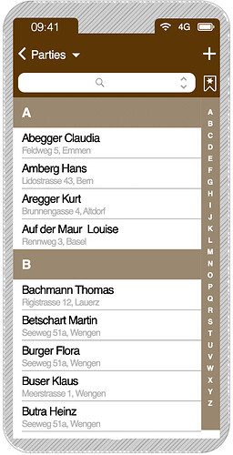
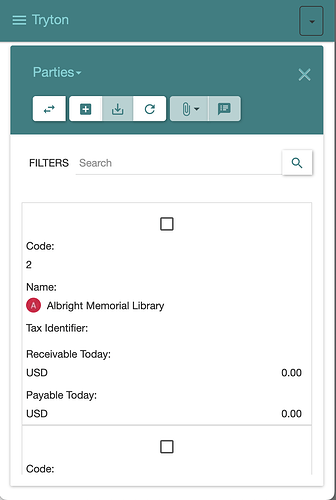
On TUB23 we discussed how to achieve a better list view on mobile phones.
A point is that we only have fingers and typing letters on smartphones is a pain.
IDEA OF A SOLUTION (AS OF TUB23)
- A kind of selector on the right side was an efficient way of finding something.
- This could be an alphabet (as when looking up parties or products) or it could also be an number or date (as for sales or projects).
Here a mockup on the one hand and an actual view of Tryton SAO V6.8.

