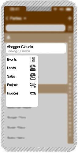
There are many ways of clicking and taping on buttons, but on smartphones it would be easy to use the context menu by just tap-and-hold on a tryton record. This way, we could make record relations and special functions accessible very easy without spreading the layout full with icons for all kind of use cases. Less is more.
Here a mockup as this could look like.
