Notice that choice was made mainly to target the users (companies, decider makers etc.) and not developers. Developers will find the necessary information in the footer.
Here is a picture of the first proposal of Webadev:
“Tryton is used in more than +30 countries of the world, has more than +50 modules, and is available in 10 languages, more than +20 IT Companies can help you implement Tryton for your business.”
Not bad for the first shot!
I miss the part that lists the benefits of using Tryton compared to proprietary solutions. A CEO or decision maker will not be interested in the first glance that it is a three-tiers platform (etc), but what his advantages are.
I agree with oscar. If the website target is final users, we should add some success histories on the front pages. Or at least give more visibility to them. Currently they are hided on the services page.
I find that the footer (links) should be more separated from the content. Maybe it should have the same background color as the toolbar.
I find that the “red” color could be a little bit more flashy but we could link it with red salamender. But I’m wondering if “yellow” could not be also an option (fire salamander). I will ask to the designer.
I’m wondering if the font size should not be a little bit bigger.
I agree that we should have probably just a slide show of logo from the success stories which link to the full story.
I do not think we should have comparison lists. We should express that Tryton is a great solution by itself. This could be achieved by describing the benefit of each modules (indeed I do not think module is the right term, we should probably speak about topic/subject/problematic and how we solve it).
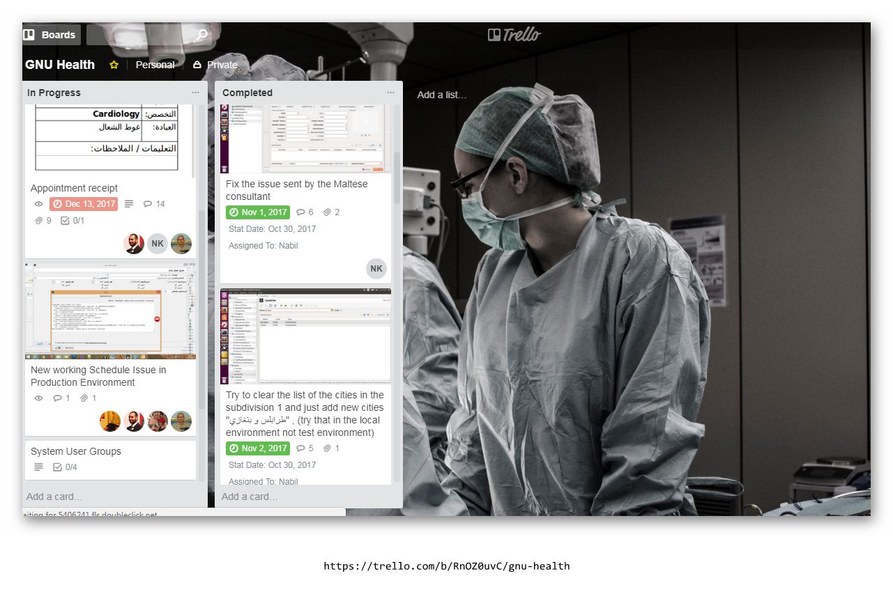
What If we can arrange the elements of the website using trello, and also we can check on the progresses.
What do you think ?
here is an example of what I am working on at the moment..