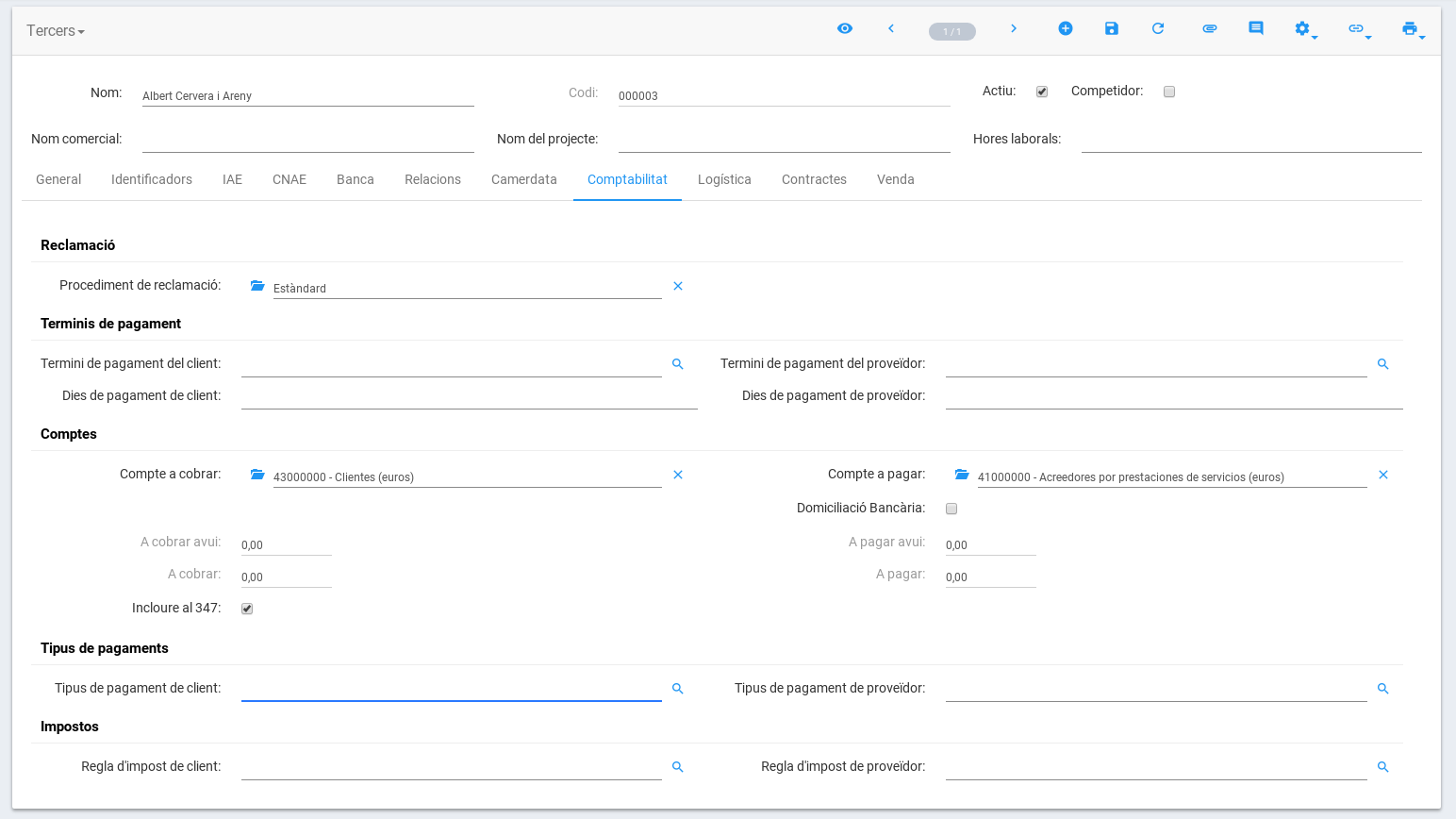
Topic New theme icon for Tryton - #16 by ced discusses the use of Material icons in both SAO and Tryton clients, but we still have our own approach to some design decisions or we simply leave some decisions to the integrator by creating a very plain interface.
Proposal
The idea is to use Material Design (https://material.io) for the whole sao application.
This makes it easier for us to make some decisions and can provide a familiar interface for the user while still allowing integrators to make their own refinements yet based on a more user friendly basis.
Implementation
At NaN-tic we already hired a designer to work on a proposal some months ago, so we’ll try to update the patch to latest changes if there’s interest in the feature.
Here’re a couple of screenshots so you can get an idea of the result:
I do not think we can talk of material design when changing the look of the widgets.
Material design is much more about the workflow, the animation and the transition.
But I think it will be very long task to actually implement them without reusing an existing implementation framework.
So for me, this screenshots are a theming work of the existing Tryton design (which makes it look like the Google theme). But I find that the Many2One are not easy to understand. And also flat buttons are difficult to understand neither.
Now, why not use an existing Bootstrap theme? Indeed I would find better to have use any Bootstrap theme working on sao. Does theme work out of the box? Have we some HTML/CSS that breaks themes? Do we need to rework some part of the HTML/CSS to make it more themable?
Mmm… I guess the screenshots are a bit outdated, I think we made the underline to go under the icon too. Not sure right now. Anyway, I think it’s a matter of taste. For me the standard style looks cluttered because of so many text boxes and so the underline looks better to me.
I understand sao tries to be simple so people can apply their own CSS but I think having a more beautiful default would be great for newcommers visiting demo.tryton.org.
I must admit we didn’t try that. My guess is that specific widgets (such as Many2One) will probably require custom CSS, but I’m not an expert.
What I was happily surprised about, is that we did not need to change any class in order to create the theme.
I’m not against providing an alternative to the minimal default bootstrap theme. But I think it should be based on existing on (or build like a bootstrap theme). sao should still work with the minimal theme.
Also we should think that soon we will have to update to Bootstrap 4, but there seems to be similar themes on bootswatch like Bootswatch: Materia
We are currently replacing the bootswrap file and as already commented on issue7622 I’m wondering if it won’t be better to provide some mechanisme to easly override the boostrap.css file to include a custom theme bootstrap css file.
I think buttons are still to cluttered. Looking at bootstrap + paper theme style I think we should use the btn-link class instead of the btn-default one for the buttons of m2o.
Here I add several screenshots comparing how m2o, m2m & o2m widgets look like with btn-link vs btn-default. This is using current style, so the paper or materia styles will remove the clutter from input boxes further:
That said, I think that paper or materia styles won’t still be enough to provide a great UI. For example, the underline is probably better that it affects the whole “form-many2one” div, instead of the input only. This way, the underline will be shown under the m2o buttons, making it more obvious that they’re part of the same widget.
This is my biggest issue with the trend of making button flat. It is no more visible that it is something to click or push on.
For me, it is semantically wrong. Button should appear as a link if they behave like a link. And they should not if they have only icons without text.
This is an issue because you are using link style for button with only icon inside.
If you find the button in input-group-btn too cluttered it is their style that must be changed and not the class.
Yet, going back to the beginning of the discussion on whether to use material (or at least be inspired by some parts of it) and the question if we can make sao to behave better with themes. I have the impression that we should create specific CSS.
For example, if we take a look at text fields:
we’ll see that the right thing to do (according to material) is to use icons (not standard buttons) shown within the container of the text field. Is there really a way to achieve that using bootstrap themes only? My guess (not an expert, as said) is that it is not possible and so we should improve default Sao CSSs.
Indeed I was looking at that. We use input-group-button because it is the way Bootstrap propose for this. Now it is possible to have custom CSS to make it works like the form-control-feedback.
We can not use form-control-feedback because it works only for one icon on the right and in Bootstrap 4 this has been replaced by standard HTML5 validation.
But the big issue with custom CSS is that it may break bootstrap themes if it is not done correctly. The solution without bootstrap seems to be a good starting point but it should work with img (for New theme icon for Tryton) and with image on both sides.