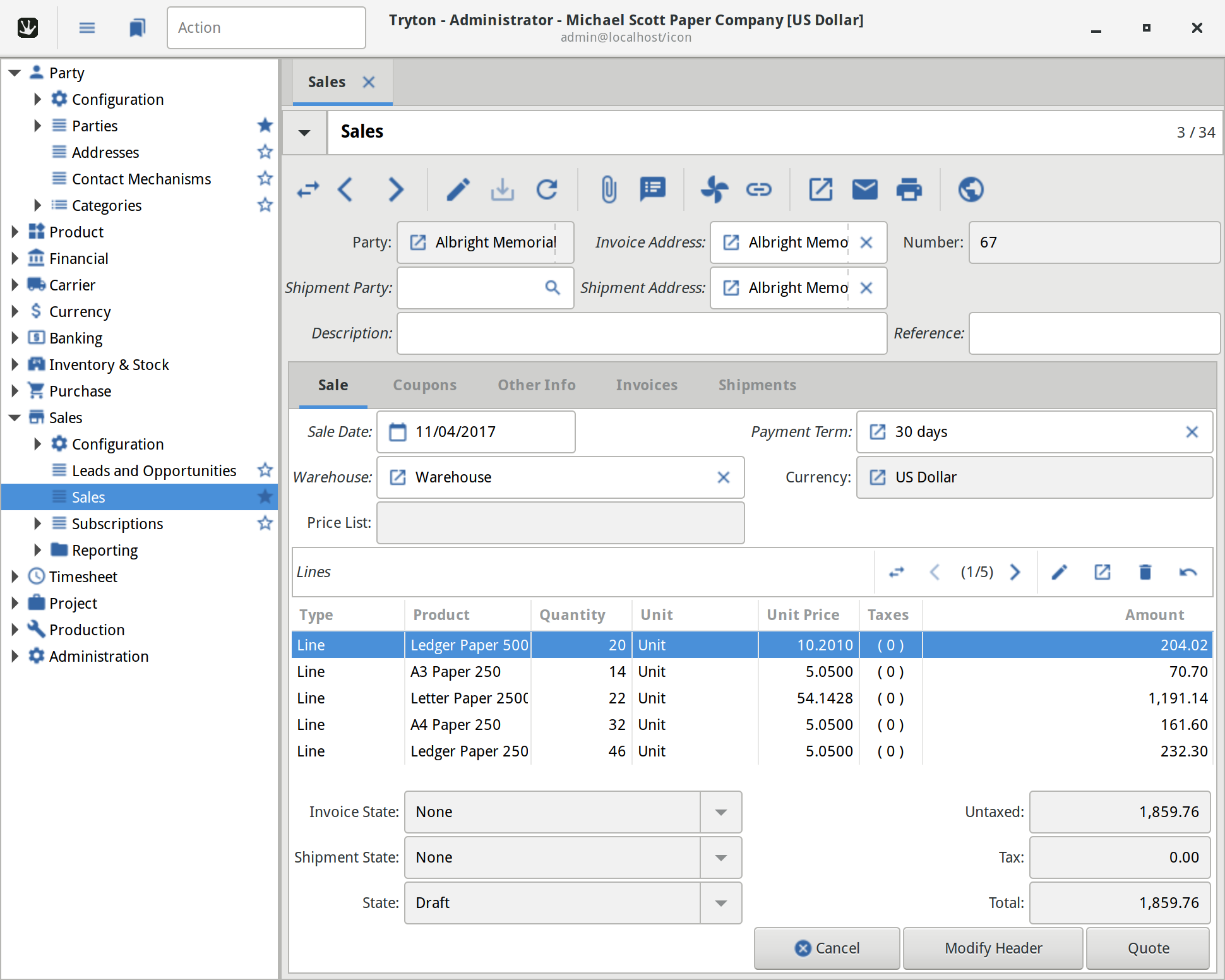
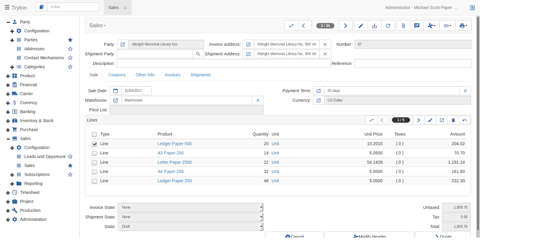
I think the icons theme on Tryton to require a new design and current it is not unified with the web client (sao), because this use another theme, when the end users switch from desktop version to the web version are confused, because the icons are completely different, this show UX design problems and integrations between versions desktop/web.
Proposal
To create a new unified and nice theme icons for Tryton.
Using the exactly the same icons in web and sao version.
Implementation
Maybe to use to crowfunding campaign for to pay a professional UX designer for that Tryton have its own icon theme.
Choose best style for start design process using a survey between community
This is an example style ideas (but I hope another proposals from community):
I quite agree on this but for me all those examples are not qualified for Tryton because of their license.
Indeed I already thought that we could use Material icons which is under Apache License v2.0. I think it is more complete than the Free part of Font Awesome and also it will be easy for designer to extend it (from our current web agency) because they are simple and without shadow.
But I think before starting on this change some work need to be done:
Indeed there is only 5 icons used by FullCalendar: bootstrapFontAwesome - Docs | FullCalendar
It will be easy to write the css rules to use the Material icons equivalent.