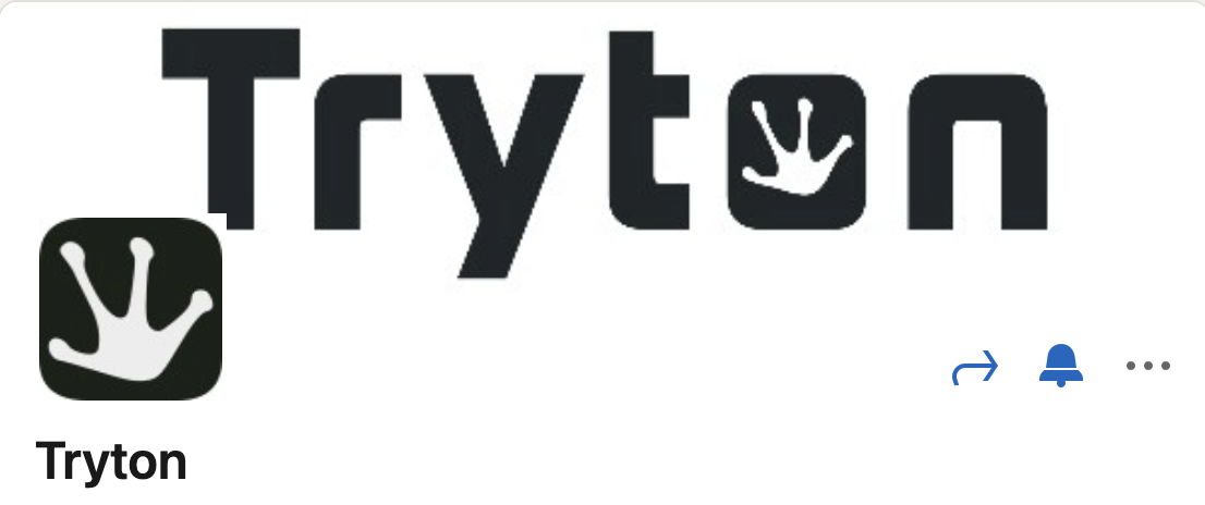
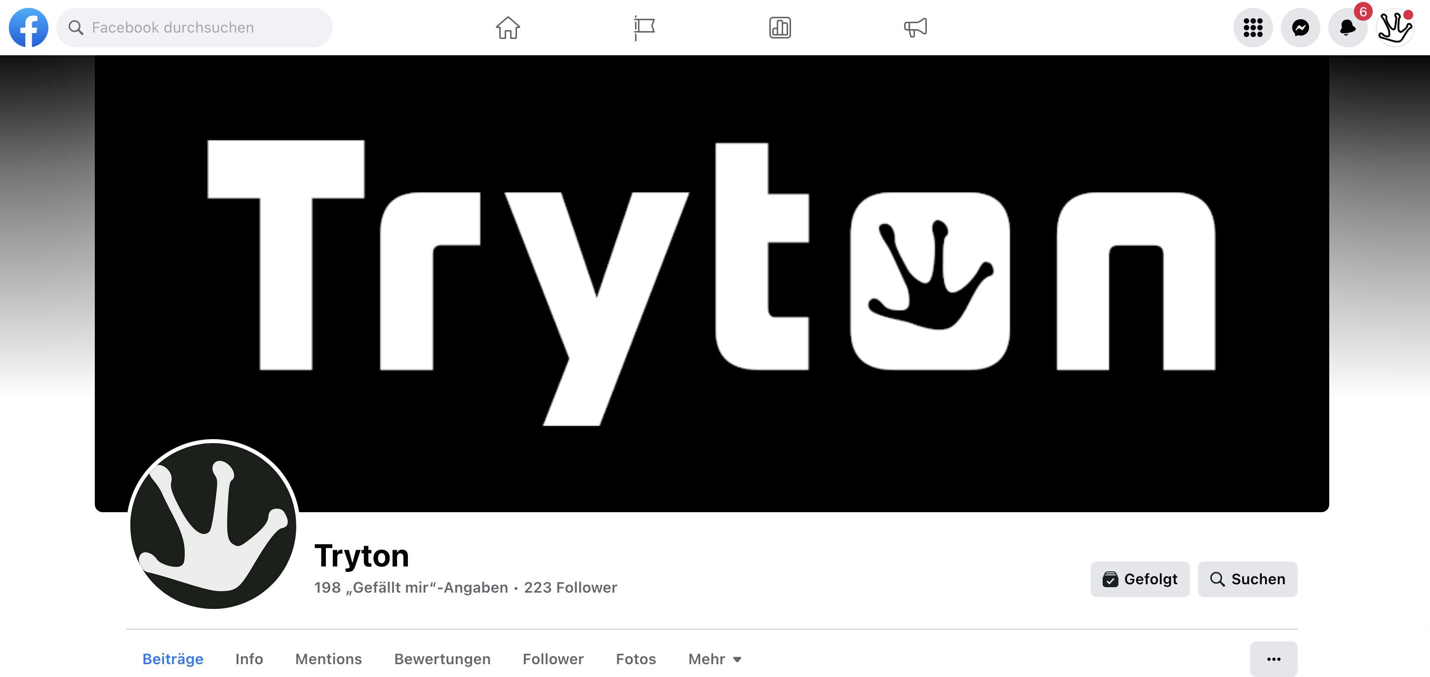
There are many Tryton Logos around.
Here the Tryton Logo currently used:


Here logos out of date or in suboptimal conditions:
![]()


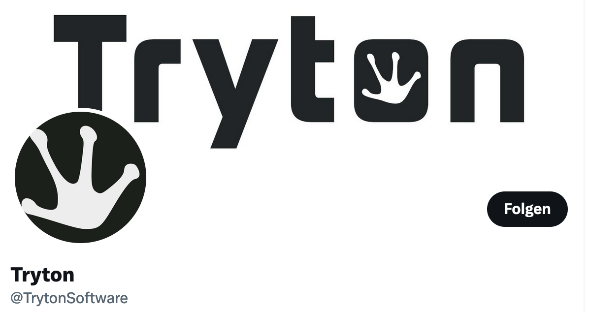
There are many Tryton Logos around.
Here the Tryton Logo currently used:
Here logos out of date or in suboptimal conditions:
![]()
Current images are stored here: https://downloads.tryton.org/images/
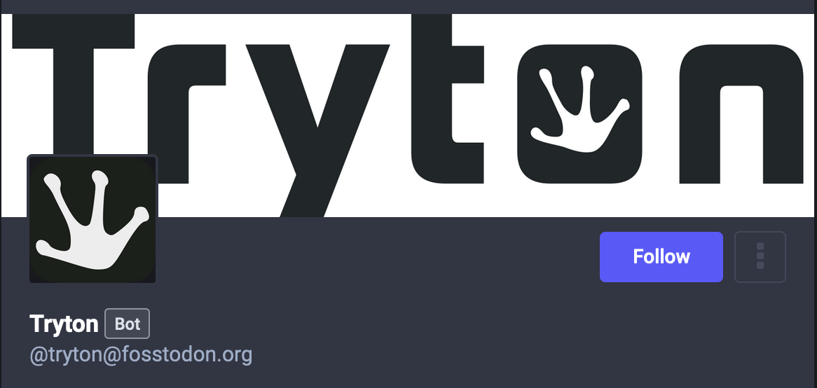
@s.vogel Not sure what the aim of this post is. I assume you want so show inconsistent use of the logo. To solve this issue it would be helpful to learn where the outdated and suboptimal logos are used. (I was able to identify Mastodon and this very forum).
Do you have concrete proposals?
Dear Hartmut. Well - yes. The inconsistency of logo communication I intended to show (I found them all around tryton social media presence and related sites of community members. The proposal was to fix the issues one by one after having defined the design strategy. So far, there seems to be a main logo and some derivates of it. Some of these derivates might be cancelled sometimes (my opinion) to enforce the main logo presence - but that’s a difficult discussion and for the moment - I prefer not interfering too much in these kind of things as I opposed to many people with the other discussion about social media design ![]()
For me the same logo is used on all the Tryton’s account. With just variation between white/black depending on the background of the application.