My fellow friend @rmartin and I needed quite some time to find out how we actually have to deal with the “project” module UI, and still we are not certain that we got all of it. From that talk, some ideas for improvement derived.
-
only use 2 instead of 3 columns for input boxes. The comment field does not have to be so large, and on smaller screens, the 3rd column may not be visible, horizontal scrolling is not very obvious in Tryton
-
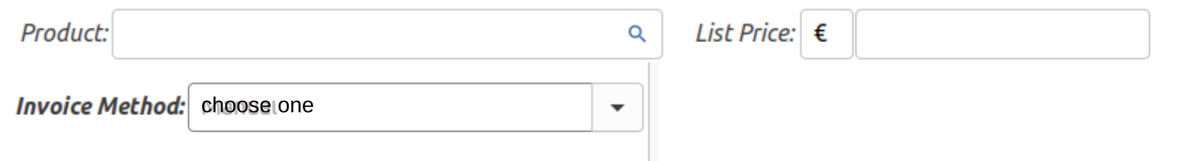
place boxes which all invoice method use, on top: product, list price, invoice method
-
set “invoice method” to “empty” with the words “choose one”, so it’s clear that this choice is essential for further proceeding. A checkbox for “always use this method” would be nice to change the default.
-
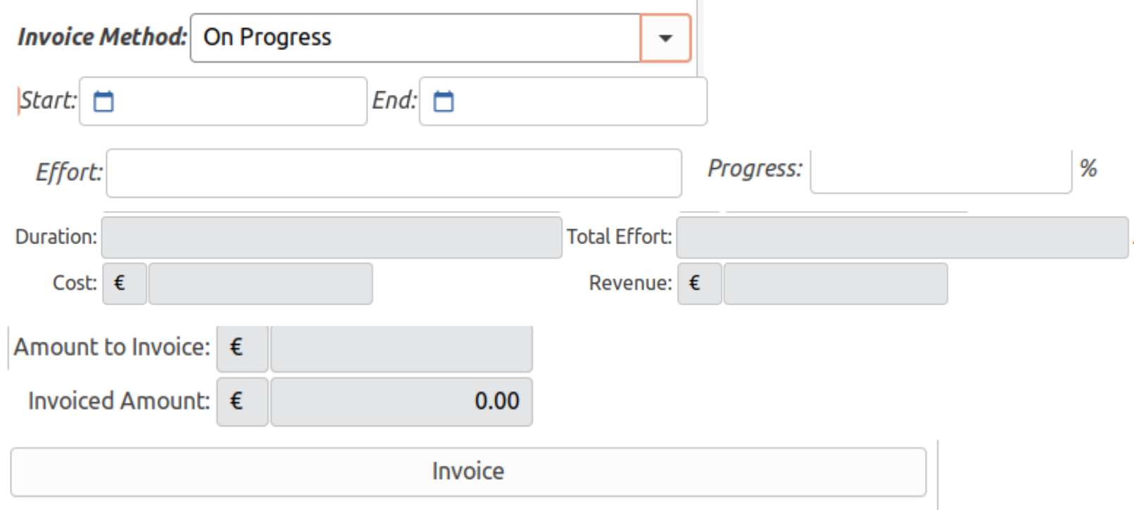
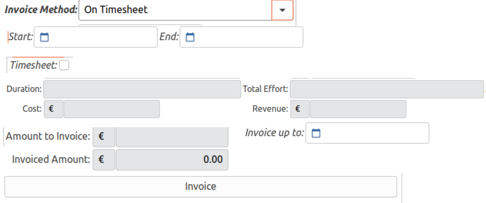
only display fields which are required in the present invoice method.
-
Place the “invoice” control under the other boxes - it can easily be overseen, when it’s so far bottom right.
-
We could not find out what the “timesheet” checkbox actually does; we were not able to mix eg “timesheet” and “on effort” method. So could it be left out?
-
We could not find out what the “status” control actually does? - Is it just for internal records, or does it influence invoicing or other?
Here are some very rough sketches to make clear what our idea is - we may have aspects we hadn’t understood correctly:
empty, nothing choosen yet:
+++++++++++++++++++++++++++++++++++++++++++++++++++++++++++++++
manual:

+++++++++++++++++++++++++++++++++++++++++++++++++++++++++++++++
on effort

+++++++++++++++++++++++++++++++++++++++++++++++++++++++++++++++
on progress
+++++++++++++++++++++++++++++++++++++++++++++++++++++++++++++++
on timesheet
+++++++++++++++++++++++++++++++++++++++++++++++++++++++++++++++
I’d be happy to pay some money to fund this improvement, but I would not want to pay for that all alone. So, if somebody else feels the wish to contribute a moderate sum, please drop a line. As well, an estimate how costly that work is would be appreciated.
Cheers,
Wolf