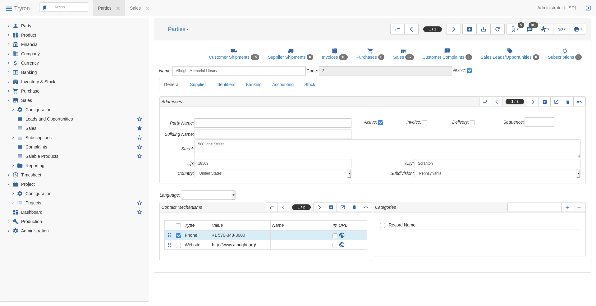
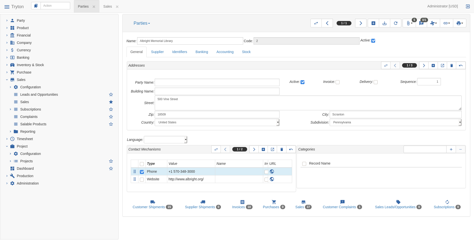
Some times the useful information about a relate is just the numbers. For example on the party form, user may be just interested to know how much draft, validated and posted invoices have the party (or shipments or sale etc.). For now to have this information, the user has to open the relate and close it after to go back to the form.
Proposal
We create a new kind of button link. It takes an action window ID as attribute: <link name="account_invoice.act_invoice_form2">
This will display a clickable box (on sao it will be a btn-link class) with as content:
If the action has not domain window, the name of the action followed by the number of record (using ModelStorage.search_count) (on sao it will use a badge class).
E.g.:
Invoices 10
If the action has domain window, the name of action followed by the name of the domain and the number of record. One domain per line and only if the domain has count attribute set.
E.g.:
Invoices
Draft 3
Validated 1
Posted 6
The domains are evaluated with the current record as active_id.
The number are refreshed on each display call by as asynchronous call (like the domain window) to avoid blocking the UI.
The button could have an optional icon. For example, we could show the accounting icon on the invoice link.
When the user click on the button, it opens the action in a new tab (like the usual relate).
Usage
We should use those links in an harmonized way. They should be always be visible so we put them on top in a group with 4 cols next to the usual active field.
On party, we display most of the relates with such button.
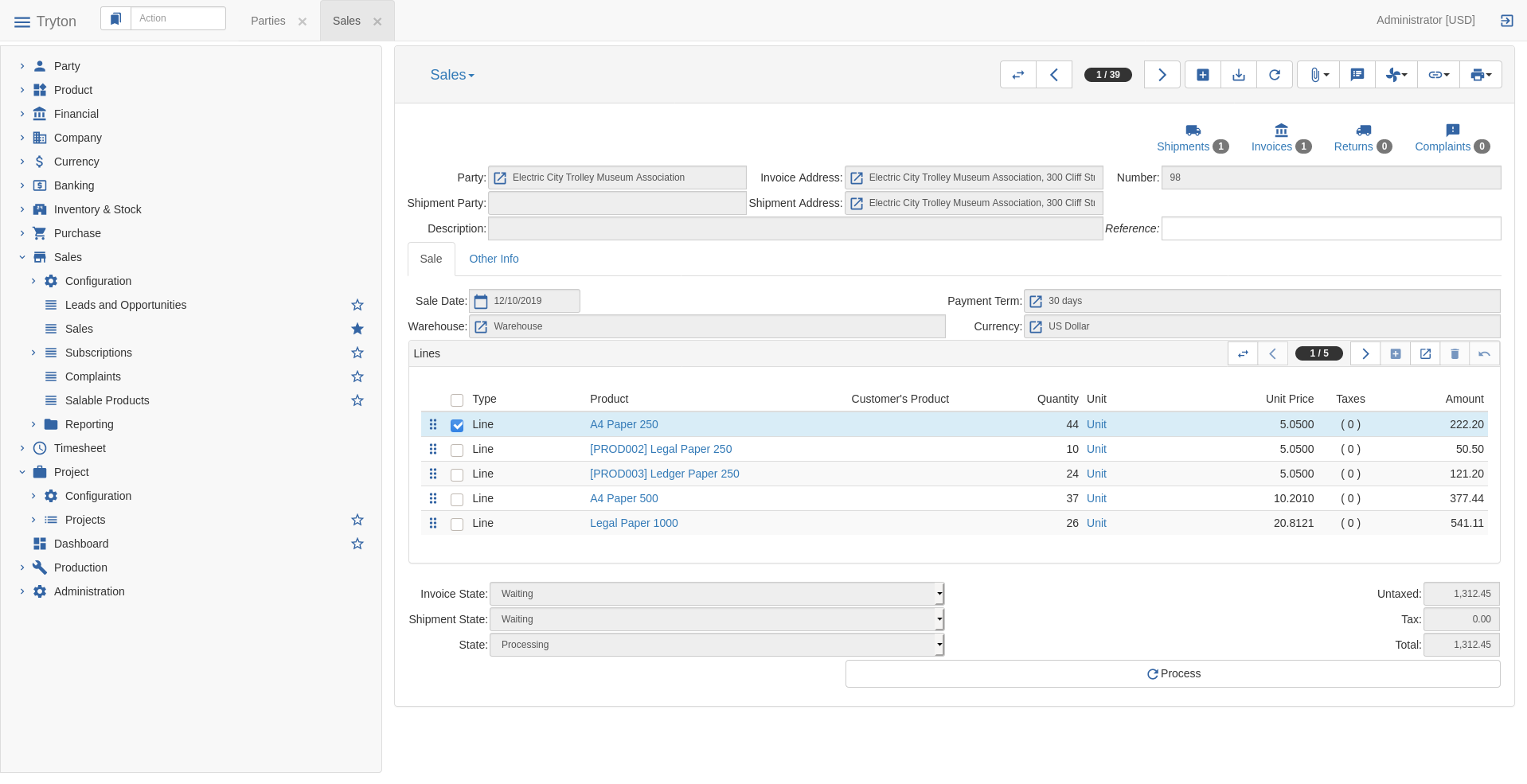
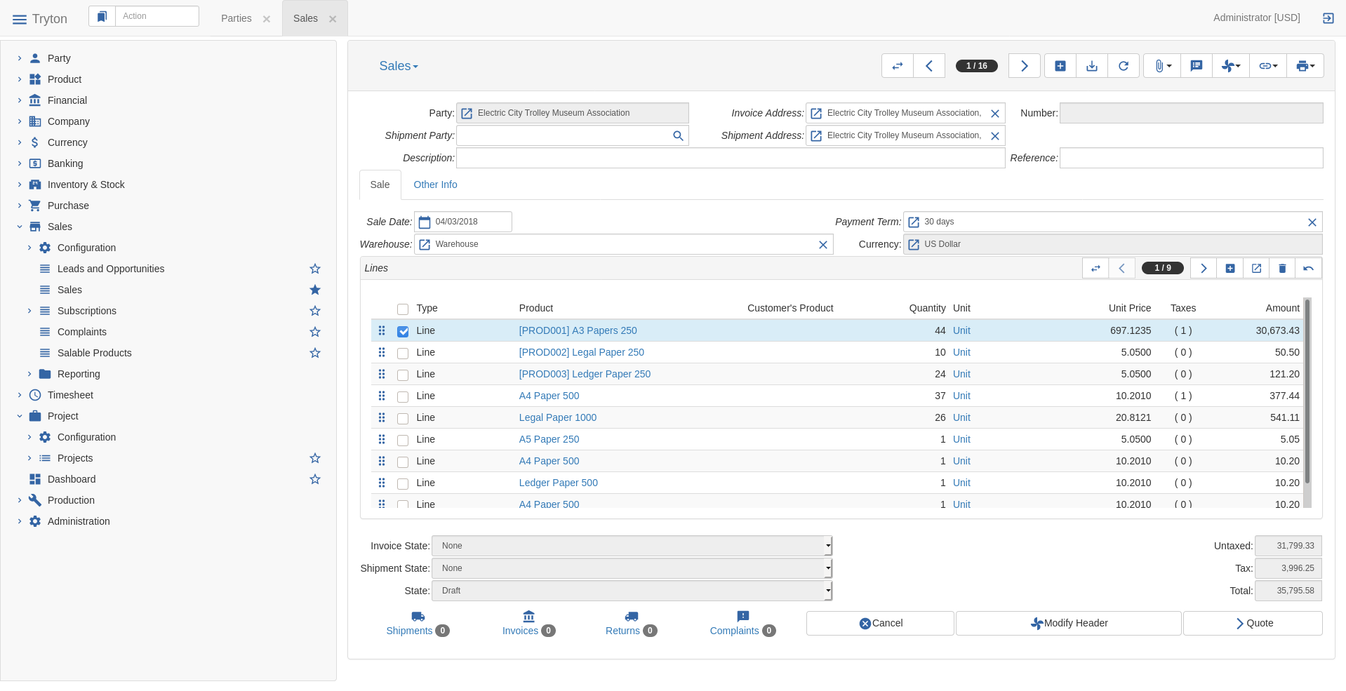
On sale and purchase, they replace the invoices and shipments tabs.
On opportunities, they replace the sales tab.
On productions, they replace the works tab.
On product categories, we add a link to products.
This sounds good, but I want to point something out about my experience with Flowfields in NAV, which in Tryton would be a kind of function fields with a relate form action:
Not always need a count of records but another numeric value. The amount to pay field on party form could be an example. We need to show an amount and would be great to click on it and launch the form relate action of accounting moves. So in this case the function field gives the amount (no matter how: python-sql, search, …) and we would need only link a window action ID with domain to the field.
For that I see the readonly many2one widget as an homogenised visualization.
I do not think it will be right to link Function field to an action. There are too much risks that they will be de-synchronized. For example, we show the amount to pay today but the relate shows all the lines to pay.
More over Function field computation can be too much complex to be shown as a list of record.
So for me, the current feature Function fields and relate are good enough for those cases and do not induce false link.
By the way, nothing prevent a developer to add a button next to a Many2One that opens the “relate” corresponding to the computation. But I do not think we should do that in standard modules.
I do not see what information we could display from URL.
If you want a button that opens an URL, it is already possible.
I do not think it will be good for three reasons. What should be counted if there are tab window? We may not want to have count for some relate with large result as it may be performance killer. What should be counted when multiple records are selected?
I’m wonderig if it won be better to have a dedicated tab on party as it’s easy to have more than 5 o 6 relates on the party form and it will bloat the UI if it’s shown on the top of the form
I think it is better to use a full line with links because of the different height between links (icons + text) and the other widget (label and field).
I’m wondering if we should display those button on the dialog box. It works but it may be a little weird for the user. Also when editing a form from a Many2One, usually we do not care too much about the links.
Some things that come to mind at the first glance:
It takes a lot of vertical space.
Lots of information (counts) will be loaded and unused in many cases
It’s not immediately clear why we want those links while at the same time we have a relate button at the toolbar (the one we already have available nowadays) that will have in some cases the same entries but in other cases it will have more or different ones. Looks like a duplicated feature to me.
I don’t see any advantage to know the number of related records for most documents.
Why don’t we simply change the behaviour of the existing relate button and make it load the counters when the user presses the button and the dropdown menu is displayed?
If desired, this horizontal menu could be shown instead of the vertical one, but the vertical one allows for more items. If the horizontal menu is used, maybe it could be a user option to have it always opened by default.
I agree with @albert.
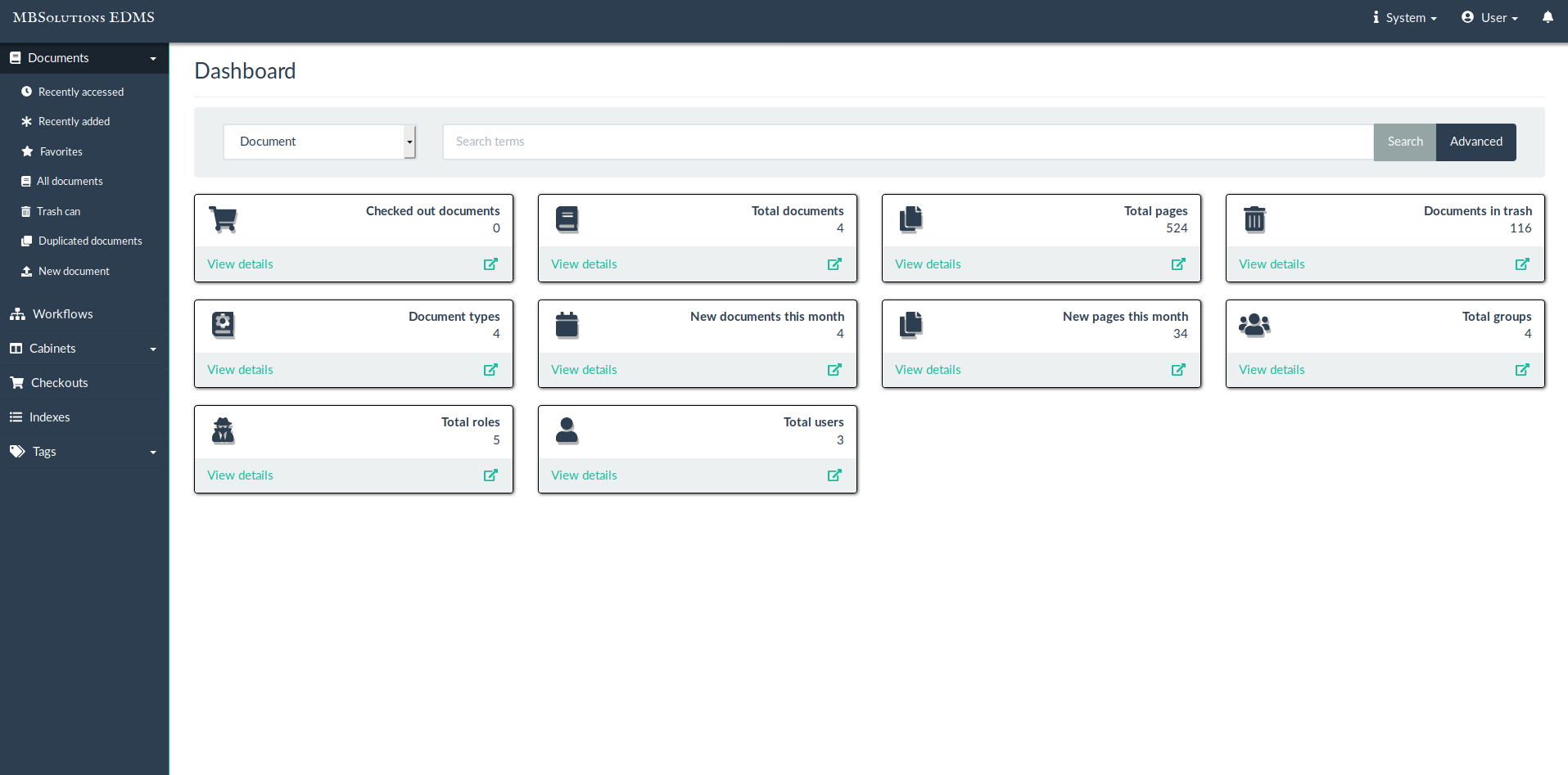
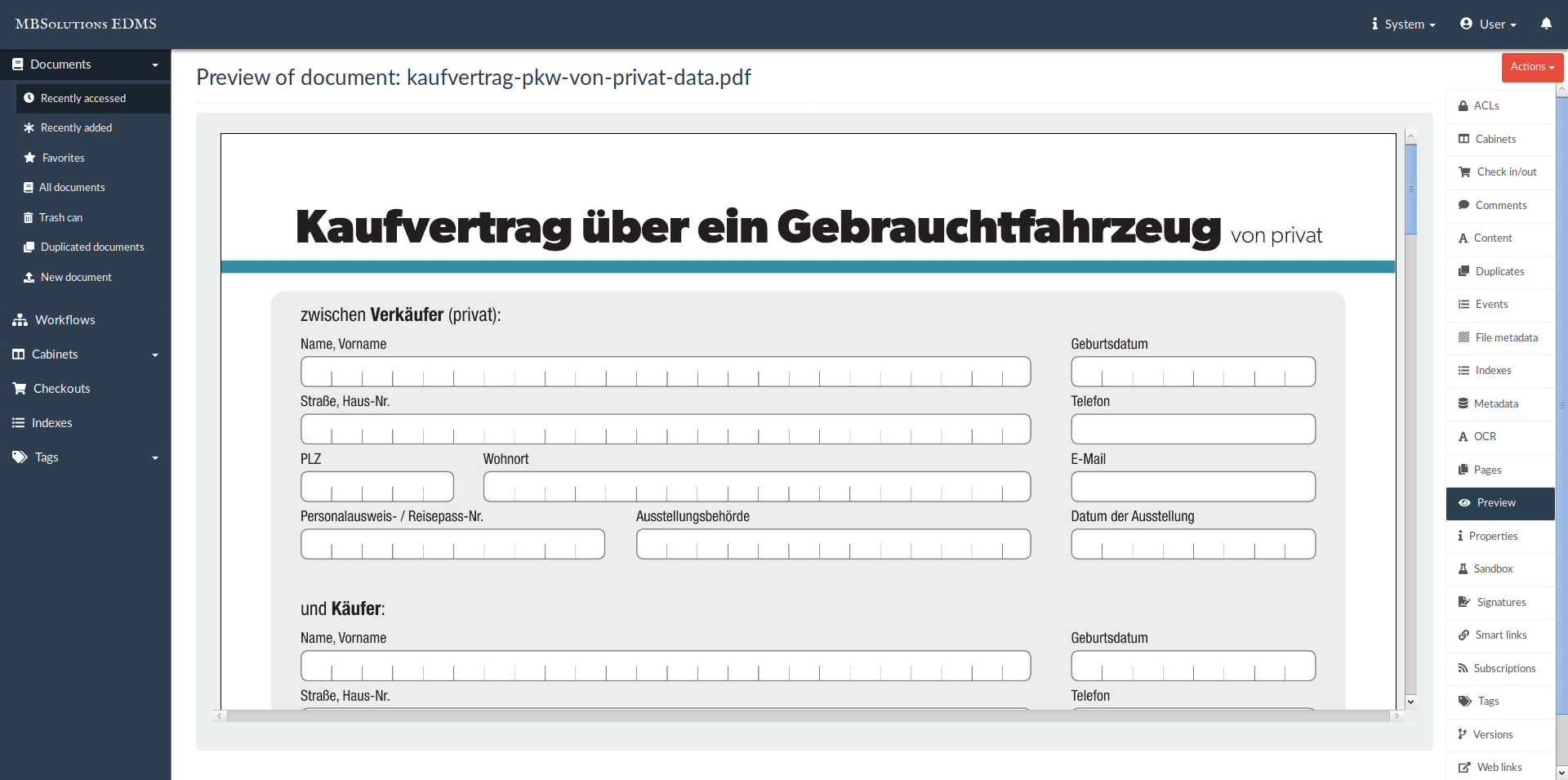
Coming back to my initial comment where comparing this functionality with similar implementation on NAV, I would like to show how this other system uses a fact box panel to show related information (right panel). IMHO this is a mix of both points due to it is visible by default, it does not take vertical space, is resizable and can be hidden completely by users if they want (there is an option to show it again).
I prefer to take vertical space than horizontal because vertical scroll is more common to users than horizontal.
The main goal is to show that there is something.
When looking at a sale order, it is good to know there are complaints or that there are two shipments etc. This allows the user to have a quick picture of what is going on (or not going on).
Relate buttons are more an advanced features. We see often that users ask question on how to find something which is in a relate but they do not know because they do not see it.
Well we display on the form the most important one for discoverability and quick view.
Well almost nothing is duplicated because we reuse the existing actions.
See:
Also it will make the display of the drop-down very slow compare to the current implementation that use a cache on the record. (menu actions are not form related as they are also on list/tree).
That’s why we keep the relate.
As usual option is the non-answer. We need to have something that works for everyone.
Also this feature is the first step to Include dashboard in base module, we can not make them optional otherwise dashboard will be pointless.
They are displayed in a group so developer can activate the expandable feature. But it will probably requires to have a feature to remember the user choice.
But the proposal not only takes horizontal space, but also allows modules to add new links, eventually using all horizontal space. What will happen when it is filled in? Add a three dot button that show the remaining entries? Horizontal scroll?
I’m not talking about duplicated for the developer but for the user.
I think that if we have a discoverability problem with linked documents, we should address that problem…
Also the fact that it is useful for the user to have “Customer Shipments” easily available in the party form does not mean that the count information is useful. So maybe like in window domains, count should be an opt-in feature.
I think that one of the things that does not convince me about the proposal is the fact that links are part of the form. I have the feeling that we should solve that at the toolbar level. And that, does not prevent to have the “link” feature for other uses.
I agree with @albert and @sergyo that the current proposal seems not really fit to provide improved accessibility to the relates.
The two horizontal bars on the screenshots are irritating in twofold aspect:
The toolbar buttons to work directly with the record are more distant from the record than the displayed related documents. This could at least changed by switching them.
There are two 'tool’bars, but with different concepts. Mixing the concept of a real toolbar with a bar showing related documents is counterintuitive. Most notably if they are designed in the exact same way.
I concur with the disputable benefit of the counts (of the documents) compared to the performance penalty they will likely have. Are there any numbers for the impact they will have in a substantially well populated database?
I think users will look even less for relates if a subset is shown via buttons. The user will rather wonder why some items will miss from the buttons and if this is a bug and why there is no consistent solution. This could be different, if the user could configure the bar herself. Like favorites for related documents.
Coming back to the original intention of this issue to show counts for the relates without having to open them: why not displaying the count directly on the relates? I saw in this discussion no argument, that doesn’t apply as well to the buttons. It could even be made a setting in the code of a relate. And yes, it should be possible to disable the display, if it implies any performance penalty.
There will be an horizontal scroll until someone implement something else for <group/>.
But there are a lot of free space as everybody said.
Also modules that add new links should take care of not design like for any other addition a module does. But it can also replace or remove as it is a tag on the view like any other thing.
So there is no problem because we have exactly the same duplication with buttons.
And this is what I’m doing. I show the important relates on the form.
Not having counts means it is not an important link so it should stay only a relate.
I’m thinking about supporting search_value to limit on party the counting to pending records based on their state. And I’m also thinking about an option to hide link if the count result is all 0.
I prefer to have links on the bottom. One reason is that they are together with the buttons, so the user knows that the bottom part is where he can do its work.
That makes sense for me, por example for parties associated to sales it does not make sense to show the purchase button. If the user wants to create a new purchase for the party the relate option can be used.
Does it really make sense to use a search_value or a domain directly? If we hide the button when there is no count a domain should be enougth to always show only pending records.
I agree, that it looks better but this proposal still moves the problem of mixing concepts to the bottom instead of the top. It just looks good on the chosen models. The party model doesn’t have action buttons at the bottom. The sales model has the very least of possible links and action buttons (think of additional modules like sale_subscription, sale_supply_drop_shipment, sale_opportunity, sale_advance_payment just to name some).
The more I look at those screenshots the more I like the idea proposed by others to create a vertical menu on the right side named ‘Important links’. It could be switched on/off just like the main menu.
Advantages:
Quick access to important links.
Evtl. display of numbers of related documents (the performance questions are not answered so far).
Easy switch to display those items or not to gain valuable space on the main work space.
Disadvantages:
If sao could be improved to make it possible to resize the width of the left menu (just like it is possible on the gtk client), i.e. also the width of an evtl. coming right menu, this would be a very good addition. This menu currently takes a lot of space depending on the device you are using.
I am joining two screenshots of EDMS Mayan showing the initial dashboard and the right menu on a selected model. I think they can serve well as an example how a right-side menu can be advantageously integrated.