maxx
October 20, 2020, 5:37am
1
Hi, with Upgrade to roundup 2.0 (#9676) · Issues · Tryton / Tryton · GitLab bugs.tryton.org is now on roundup 2.0.
Indeed it was small, but i could read everything (zooming on it).
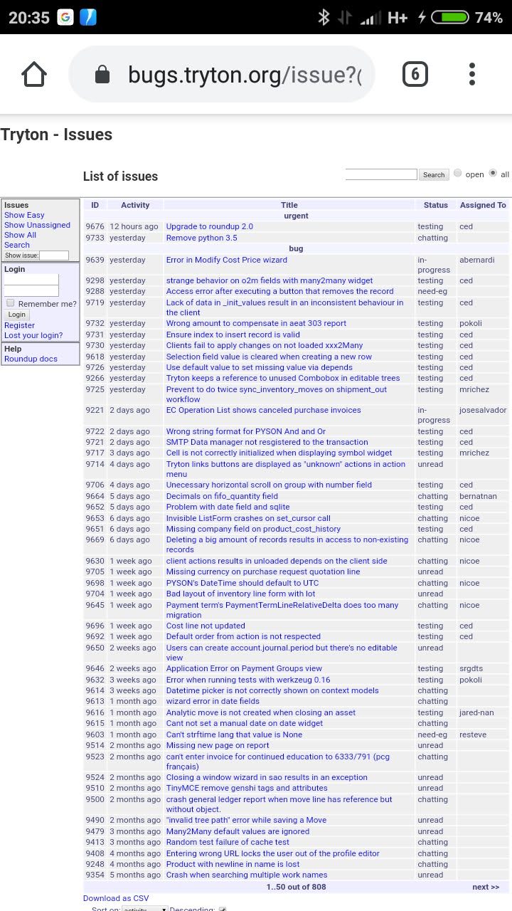
Here’s the new interface (yesterday morning):
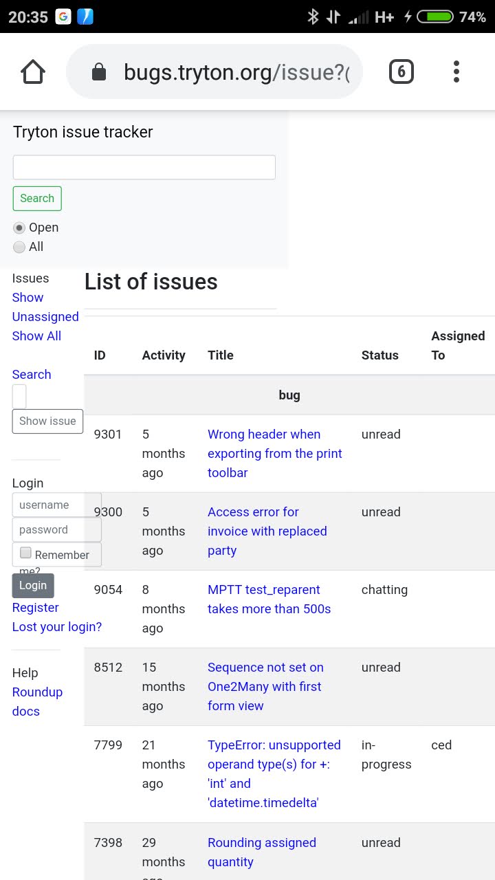
And yesterday in the evening (horizontal and vertical orientation):
Indeed, i’m not often using my smartphone to check bugs.tryton.org but some improvements should be done for a better readability (more responsive or another layout for small screens).
Thanks!
ced
October 20, 2020, 9:17am
2
But it has no viewport property which was the complaint of Google: Update roundup template to be responsive (#9066) · Issues · Tryton / Tryton · GitLab
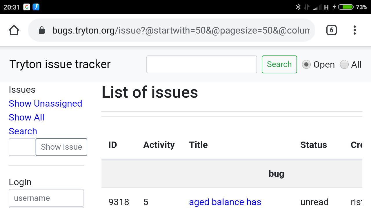
It is already better as I pushed some changes: https://hg.tryton.org/bugs.tryton.org
But indeed the side-bar could have a better behavior. For example it could be hidden on small screen and the display toggled by a navbar toggler.
Indeed one of the goal to use jinja2 as template engine is to allow more people to contribute as it is more common than zope template.
ced
October 20, 2020, 9:03pm
3
Here is https://codereview.tryton.org/304551002 which tries to improve the layout on small screens.
ced
October 21, 2020, 9:36am
4
I temporary applied the patch on bugs.tryton.org (
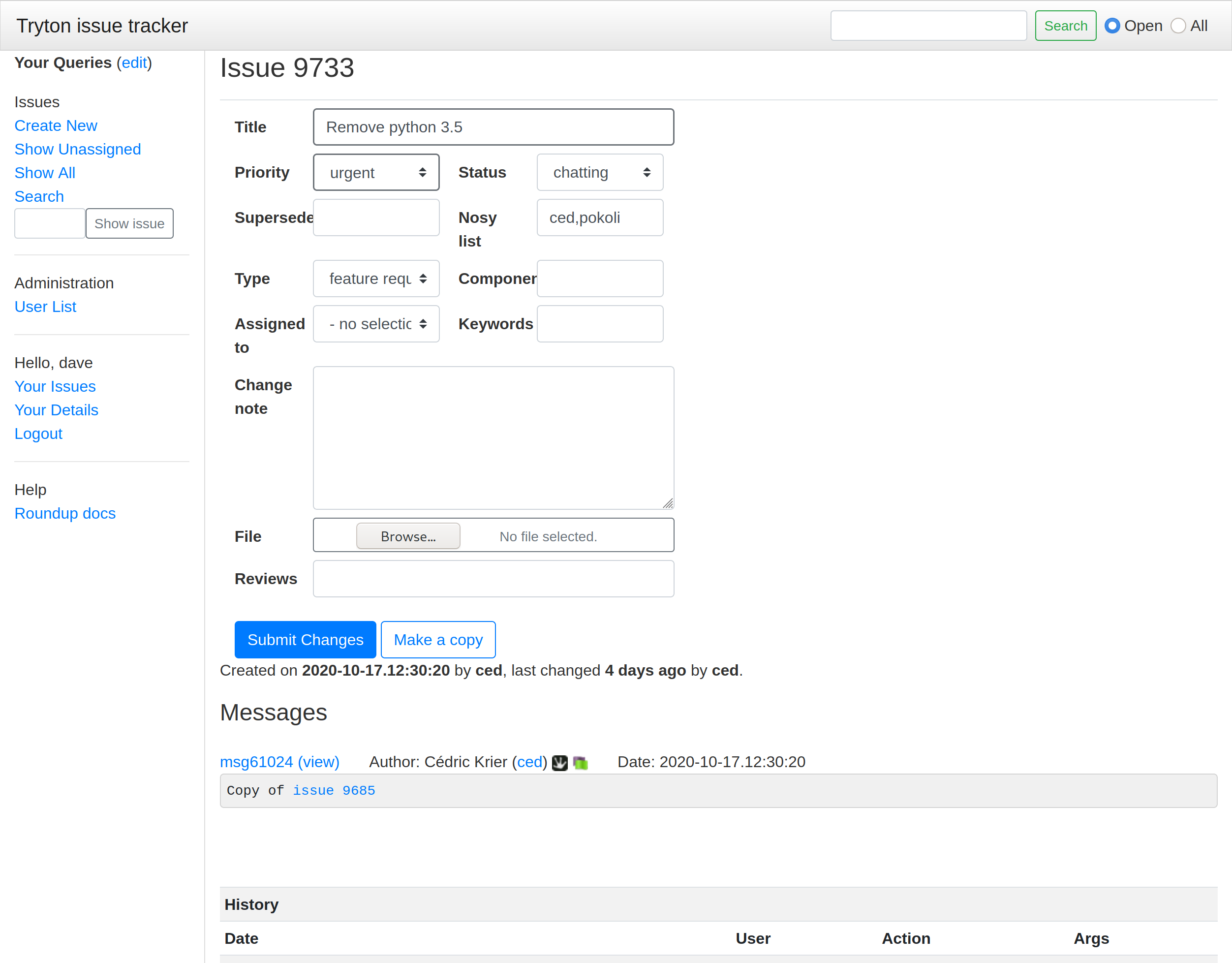
dave
October 21, 2020, 10:00am
5
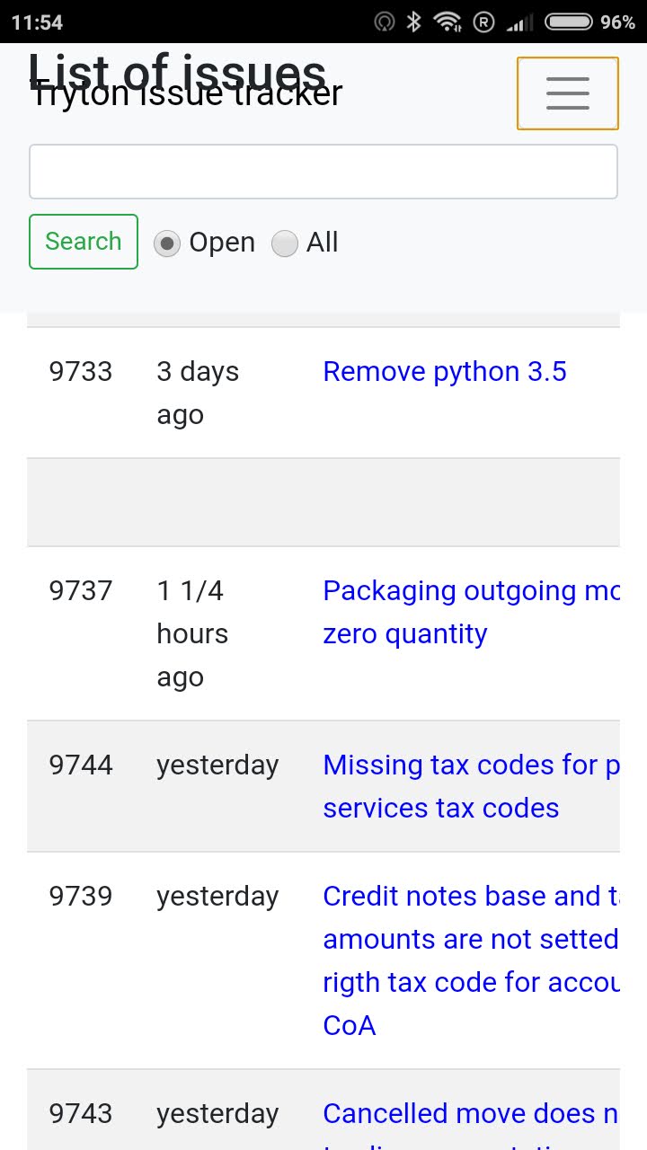
It seems better, a few things I have noticed:
On my mobile (iOS):
The “List of Issues” stays in front of the title bar, and the dropdown menu when pressing the button with the 3 horizontal lines.
In a desktop browser (Firefox):
Part of the search box in the top left, and the [Show Issue] button get cut off / hidden behind the main page content.
Also in the desktop browser (and probably unrelated to this issue):
When creating an new issue the data entry boxes only fill about half of the screen horizonally.
maxx
October 21, 2020, 10:01am
6
Thanks! Much better
Just a small problem with title “List of issues” which stay over the header when scrolling down.
And maybe the title of the sections (bugs, features,… ) could be centered on the view ?
ced
October 21, 2020, 10:12am
7
I tried to make the title always visible but as the navbar height is not constant it is difficult. I’ll remove it.
Indeed I will make it smaller.
This is on purpose, it is the col-xl-6 on the form. I think it is good because it keeps the form compact on large screen.
pokoli
October 21, 2020, 10:34am
8
Which is the benefit of keeping the form small?
Indeed i noted the same issue as dave, I will prefer to have all the available screen for writing the issues instead of having half of the screen empty.
Maybe we should use col-xl-9?
ced
October 21, 2020, 10:37am
9
For the same reason we enforce 80col in the code, it is easier to read.
dave
October 21, 2020, 10:41am
10
I think it might be better if the <form> was put into a <div class="container">. It would be a fixed width then, which would keep it compact on larger screens and would make it wider when used in windows that were just over 1200px wide.
It looks like this for me:
pokoli
October 21, 2020, 10:43am
11
The messages (where we read the text) does not have the col-xl-6 so the expand the full of width of the form
For me it does not make sense to enforce writing on small widget when the message will be rendered with full width.
ced
October 21, 2020, 10:51am
12
Indeed it provides a more stable width then col-xl-6.
dave
October 21, 2020, 10:53am
13
Thanks, that seems to work really well now.
udono
October 22, 2020, 10:58am
14
It would be good to use a monotype font for the message
ced
October 22, 2020, 11:40am
15
It is used if you format your message with the code syntax .
1 Like

 refresh your cache).
