Why do you think this accouting visualization adds some value? Which information is shown on this view that is not including as part of some more generic accounting dashboard?
The relative importance of accounts is better displayed this way.
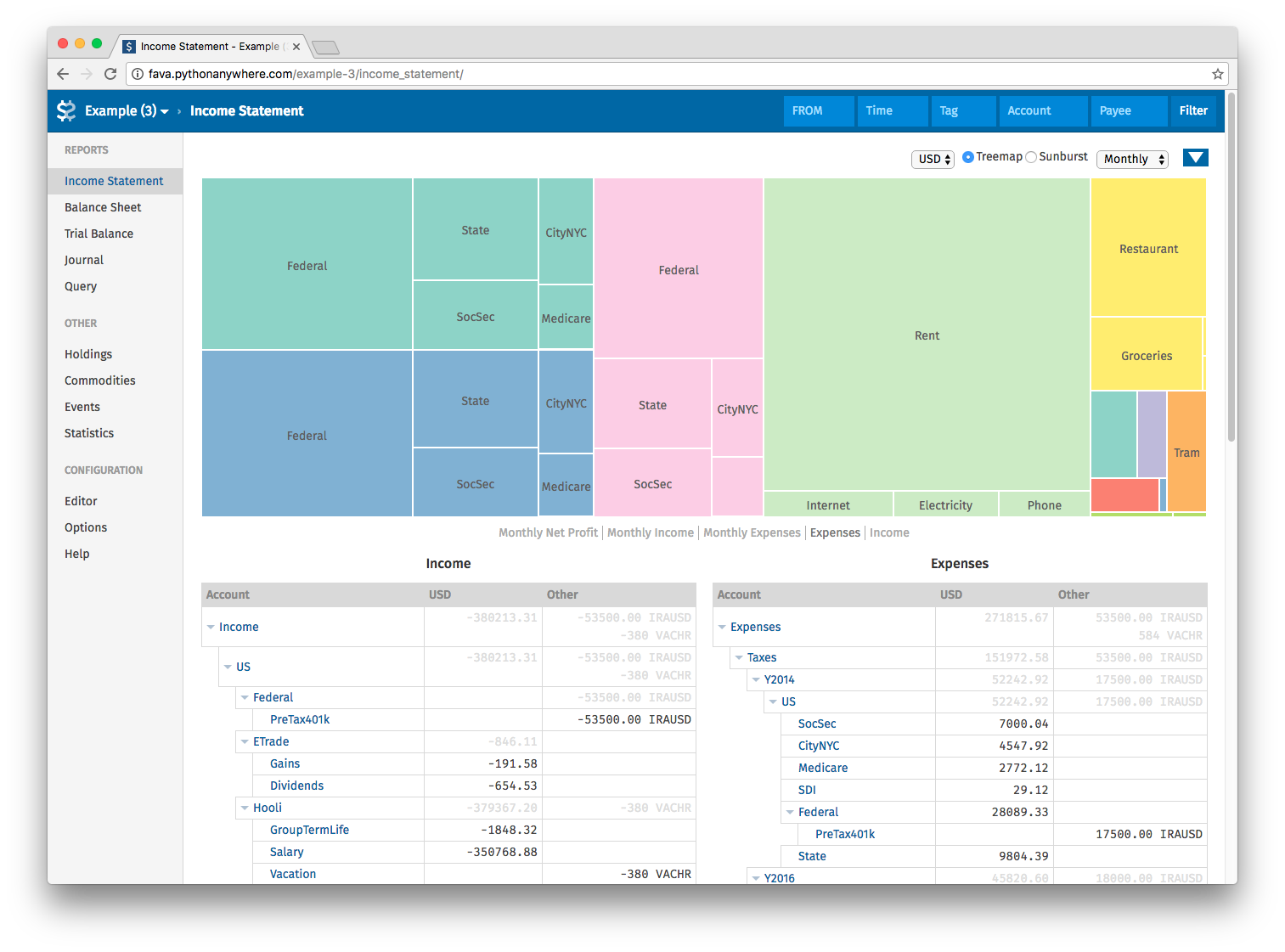
They are showing the expenses in the example above and you can immediately see the huge green square that is the Rent. Of course you don’t have a precise number out of the graph (ie is the rent > to the taxes of one year ?) but I don’t think it’s the goal of such a visualisation.
Moreover the tree nature of the data is correctly shown while flat bar charts or pies do not make justice to this fact (or you have numerous occurences of those but it will become difficult to read and keep in mind).
Of course, but IMHO before diging on each account we need to distinguish the evolution of the amounts in each type of account.
So following your example I think we need first to show how much expenses we had. If the rent is a recurring amount having a huge green square it is not relevant because he know that his have to pay this amount each period. This make me think that this graph may be usefull to dig into the detail of an account type.
Just to clarify: probably it is a nice feature to have this kind of graph views for accounting but I’m not sure if it’s worth the effort to create a new graph type without having basic accounting graph (using current graph types) that can be used as starting point for most of the users.
Of course, that’s why it’s in the “Idea” category, it’s just the kind of visualization that we should keep in the back of our head for when we want to add some eye-candy to Tryton.
The example is based on the income statement. So it is per period or fiscal year which makes sense.
Of course such graph would have no value on the general ledger.