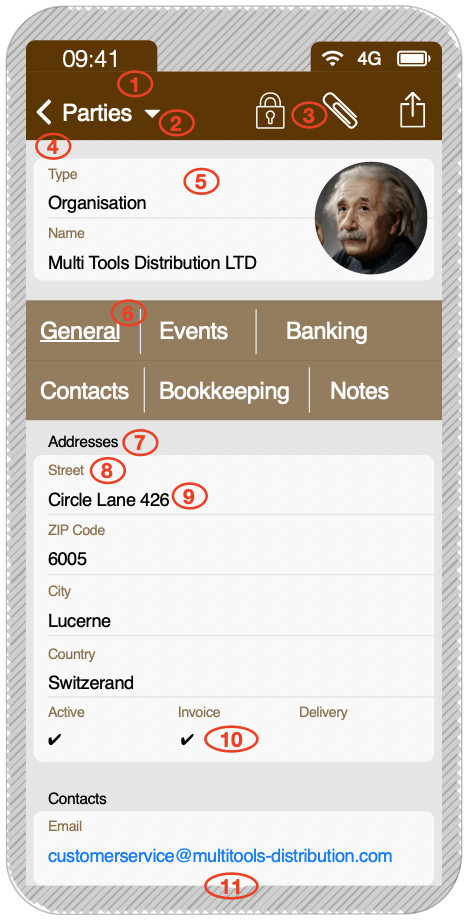
So far in 6.8, the views look kind of “flat”, meaning our eyes and brain have problems distinguish between text-buttons, field-descriptions and text-content. See screenshots below.
IDEAS TO OPTIMIZE FORM VIEW
First of all, let’s define one important thing:
- Navigation and menus have a background (in my proposal colored with white text)
- Content on the other hand has a white background. Because it is white, eye and brain interpret it as “content” because it remembers kind of white paper.
Now let’s have a look at it in detail
- Main menu background. Darker as secondary menus like tabs (6)
- Click on the arrow to access to open the menu with all the functions available like on desktop.
- Important functions have an icon. Opening and closing the lock makes the record editable and then saves it. Attachments are highly welcome on smartphones, eg for taking pictures of invoices or products or paper. The share icon is for printing and exporting the data.
- All of the record stays on a light grey background…
- … so, the white content fields get optical priority.
- Tabs are menus, so they have background. All tabs shall bei visible, because horizontal scrolling is not common on smartphones.
- The field groups have a title as on the desktop view. It can be very small. Maybe black or even better in the same color as the other field descriptions.
- Our brain works faster, if it can grab the important things fast and neglect the less important. Field descriptions are only important for the user as long as the data field is empty. Afterwards, the content mostly is self explaining. Therefore, field descriptions are in light color.
- The most important stuff is black. It has maximal contrast to the background so our brain looks at it first, also because humans are used in reading black text on white background. The content fields are underneath the description fields, because otherwise the content doesn’t have enough horizontal space.
- A set of button-selectors might geht arranged horizontally on one line if possible to safe space and make the layout better readable.
- Scrolling down is fine.
Here a mockup and a screenshot of 6.8 to better show the reasons for the optimizations.